|
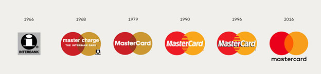
In the old logo, the word MasterCard was placed inside the interlocking circles. In the new logo, the word is outside the circles. This change makes the mark more flexible—it easily can be rendered horizontally or vertically.
Also, the letters “M” and “C” were capitalized in the old logo; in the new one, all the letters are lowercase. The result is a visual nod to the evolution of payment.
MasterCard now has a new look, though it might seem a bit familiar but that was done on purpose.
One of the subtle changes was to lowercase the “C” in the card, as a visual cue to de-emphasize how we are not just a card or a piece of plastic in your wallet.
It’s a nod to a much broader digital extension to our products like Masterpass. The goal was to convey simplicity and modernity while preserving our heritage. We want to create a bold distinctive look and feel across every touch point, a new brand identity that unmistakably is recognized as Mastercard, no matter where you are in the world or what device you are on.
|